Futurism

The definition of futurism is

“A belief that the meaning of life and one’s personal fulfillment lie in the future and not in the present or past”,

which came as a great shock to me. I had no idea that such people in the past wanted to obliterate history and how we developed in art and also culture. Futurism was in fact a type of fascism with the leader Filippo Marinetti publishing the ‘Manifeste du futurisme’ which had orders to the reader to do as he says, the futurism way. After reading sections of the manifesto I disagree with almost all of what was said by Marinetti. His views were very direct and also cruel.

“We want to demolish museums and libraries, fight morality, feminism”

this quote sums up the Futurists, they didn’t care about the past, they wanted to destroy it and start again. I think this quote is very narrow minded they didn’t care about what made the present, which was the past and just about the future and how it would be for them. Which in itself if very selfish. Many people have worked hard to get the art world etc up to how it was in those days and the futurists didn’t care about that. Although I am against futurism I admire their desire to be original and to not look at past artists and people for inspiration or to copy. I myself don’t particularly like looking at previous artists from the past or present for inspiration. Futurists were themselves, original. When you discuss futurism it makes you have an opinion, are you for or against it.

Sources:

Futurism (art) – definition of futurism (art) by the Free Online Dictionary, Thesaurus and Encyclopaedia. http://www.thefreedictionary.com/Futurism+(art) [Electronically accessed 18th November, 2013.]

The Futurist Maifesto. http://vserver1.cscs.lsa.umich.edu/~crshalizi/T4PM/futurist-manifesto.html  [Electronically accessed 18th November, 2013.]
Creative Futures

On the week commencing on the 4th of march until the 7th I attended the creative futures week at Glyndwr University. The week involved many people who are involved and have much experience in the creative world. Varying from film and gaming to graphic design and illustration. On the Monday the 4th of march I attended my first talk which was ‘How NOT to be a designer’ by Robert Ball. This talk was highly applicable and informative it was also quite humorous. As there were many things in his slides which made the people listening laugh as he took the micky out of designers who design things wrong. The next talk that I went to was the next day on Tuesday 5th of March which was ‘Product Design, Cross disciplinary collaborations…and how chickens helped me!!’ By Peter Hathaway. I was intrigued by the title of this talk to decided to attend, the talk was mainly about Peter Hathaway and how he had become successful himself as a product designer and also how he has worked in the industry. This talk didn’t help me a great deal as it was to do with product design although I could understand a lot of what Mr Hathaway was saying as I did A level Product design. After attending this talk I went to listen to ‘Getting a job in the media’ by Phil Hurst. This talk was very informative and also very helpful. I gained many things by attending this talk like knowing how to approach interviews and also correctly put together a portfolio. Although maybe the talk was intended towards 2nd and 3rd years it’s always good to look ahead. I enjoyed this week as it helped me realise how hard I have to work to reach the places I want to go in my career and also hearing experience from others helps a lot to contribute to my own path. Hopefully I remember these talks in the future when perusing my career.

Evaluation

While doing the Heroes and Heroines project I think that I have learnt a different way of learning and researching. I have researched my artists very thoroughly and have also learnt many things about the artists and their artwork while doing this. Yet as I have said before I think that I could have gone in to even more detail with researching the artists by physical research for example going to the library etc. My research was critical to contributing to my ideas for this brief. It would have been nearly impossible to complete this project without research as most of the artists I didn’t know. Visual language was also important with completing this brief as I needed to comment on the work of the artists and praise and criticize when needed. The most significant learning experience with this assignment has to be learning about all these artists and designers and also film makers that I did not know much if any about. I feel that this research will help me in years to come and also helps me with inspiration now.

Neville Brody

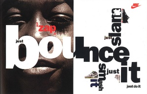
Neville Brody is a famous British Graphic Designer, typographer and also an art director. When he first started off as a Designer he was working in record cover design but then went on to further his talent in his revolutionary work as Art Director for the Face Magazine. Other international magazines that Brody has worked for and directed are City Limits, Lei, Per Lui, Actuel and Arena, together with London’s The Observer newspaper and magazine. In 1988 Brody published his own Graphic Design book ‘The Graphic Design Language of Neville Brody’ which went on to become the world’s best selling graphic design book and then went on to publish a volume 2 of the book. The sales combined now exceed 120,000. Brody’s work is very original and is very heavily involved with typography within it. He has created adverts for famous companies such as Nike. I am a big fan of Brody’s work as he makes typography into an art and also looks a lot different than what other people have created.

Neville Brody neville-brody-3

Jonny Hannah

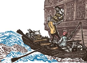
Jonny Hannah is a Scottish illustrator that studied illustration at Liverpool Art School, he was taught and tutored by the famous Peter Bailey. Hannah graduated in 1998 and since then has worked as an illustrator in most fields of the illustration world. He works on his own and in collaborations most famously with the animator Jonathon Hodgson who created ‘The Man With The Beautiful Eyes’ together with Jonny Hannah for Channel 4. This piece of work got them many awards including a BAFTA. Jonny Hannah’s work is very precious and sells out very quickly in most places that it is on sale at. I am not a big fan of illustration but while I look at Jonny Hannah’s work I appreciate it greatly as it is very similar to graphic design and almost is graphic design itself.

Image

Sources:

http://www.hornseys.com/art/contemporary/jonny-hannah

Spike Jonze

Spike Jonze ( real name Adam Speigel) born 22 October 1969 is an American Director, producer,screenwriter and actor. His work includes music videos, commercials,film and television. In 2006 he was nominated for ‘ Outstanding Achievement in Commercials in 2005’ by Directors Guild of America. These included brands including Adidas, Ikea and The Gap. He was a producer and co-creator of MTV series Jackass and Jackass The  Movie. He was involved, as his alter-ego Richard Koufey in the Fatboy Slim ‘Praise You’, the music video which was a huge success as i remember it as a 6 year old and was performed at the 1999 MTV Video Music Awards. He has won awards as director for the films ‘Being John Malkovich’ 1999, ‘Adaptation’ 2002, ‘Where the Wild Thing Are’ 2009. He has also directed music videos for Bjork, Beastie Boya and Kanye West which are very widely looked at and appreciated.

Here is one of the music video’s Spike Jonze directed. Fatboy Slim – Weapon of Choice

Susan Kane

Susan Kane graduated from Manchester University with 1st class Hons degree,Working extensively in the fashion and furnishing industries before establishing ‘Calico Textile Design’. Her portfolio of clients include Mary Quant, Monsoon, DKNYand Ralph Lauren. She is inspired by the cities of New York,Paris and Tokyo in her design work. For example – baroque architecture and subdued colours of Paris,shimmering glass towers of New York and the traditionalism of Japan. Along design,Susan produces pictured.They have a simple narrative quality, exploring the placement of line,shape,colour and the sequences that emerge. While looking at Kane’s work I have realised I dont often take a liking to Textile work and often think its quite boring and repeative. Kane’s work hasn’t changed my view on this and I don’t think textile art will ever be an interest of mine.

John Lawrence

John Lawrence is a British illustrator from Hastings born in 1933. After doing military service in West Africa between 1953 – 1955 he went on to study at the Central School of Arts and Crafts from 1955- 1957. after finishing at the school of arts since then Lawrence has freelanced and has illustrated more than 250 in his time and also some which he has written himself. His work is of a very wide range from adult books to children books. His best selling book that he has illustrated for is ‘Watership Down’ by Richard Adams. Lawrence has won many awards during his time most notably ‘The Francis Williams Award for illustration’, an award which he has won twice. While researching Lawrence I found his work very interesting and all his work is very well made and also old fashioned. His work I can only describe as very detailed with pen and also with paint. You can tell by just a glance that Lawrence spends a lot of time on his illustrations.

Lawrence-John-TREA_HR_128-129

Alan Fletcher

Alan Fletcher was a British Graphic Designer born in 1931. He was described by The Daily Telegraph as being “the most highly regarded graphic designer of his generation, and probably one of the most prolific”. He was a Graphic designer who worked with many different clients during his design career. Along with Colin Forbes and Bob Gill, they produced the book Graphic Design: A Visual Comparison. Alan Fletcher had also produced a cover for Fortune Magazine in the year 1958 which was very successful  He has written many books on the subject of graphic design. Alan has worked with many clients but one of the most famous one of all was the company that makes robotics and tyres Pirelli which he created their logo for them and is noticeable to any typographer as the top of the P in Pirelli makes it stand out and be very different. His work is very clean and professional which is why I like it and look up to Designers like Fletcher.

Scott McCloud

Scott McCloud is an American comic book artist and cartoonist born in 1960. They are usually a very artistic medium and is most notable for his factual books about comics which include Understanding ComicsReinventing Comics and Making Comics, for which he has been called the “Marshall McLuhan of comics”. McCloud sketches his layouts in pencil and the remainder of his work is done digitally, while making his book in 2006 named Making Comics he had been quoted to say that he had not used traditional materials like Bristol board, pens or brushes in years. Many of his cartoons are in black and white and this surprised me as I thought colour would make them stand out more and engage to the audience but it seems they already do in black and white. I am interested in cartoons as an art and they are one of the only things in illustrations that interest me therefore i am really interested in McClouds work and have a high opinion of his work.